Get to Know Veronica Fuerte of Hey Studio
Choosing the right design studio is analogous to dating - when you find someone who gets you and makes you a better version of yourself, it's a match. This describes TORTUGA's experience working with the renowned, Barcelona-based Hey Studio who created our company's branding and packaging. We chatted with Hey Studio founder Veronica Fuerte about her design approach, influences, thoughts on being a female founder, and favorite font and Pantone color of the moment.

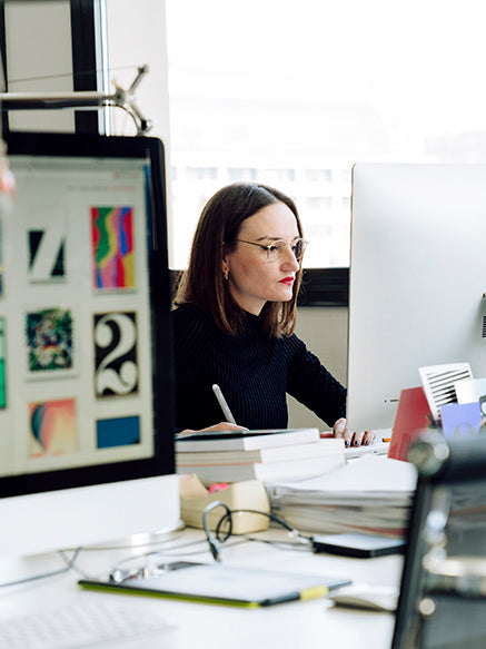
Photo by Enric Badrinas, 2018
How did you arrive at your own branding identity and name for Hey Studio?
Choosing a name for yourself is never easy. There are so many things to take into account. I suppose the easiest would be to use your own name but I ruled that out early on. For me, it was perhaps too much about you as the founder rather than the company as a team. So that left me with my lengthy lists of concrete and abstract things. That list quickly became shorter because I wanted the name to work internationally. In the end, we chose "Hey" because it reflected my personality and captured the attitude I wanted to project.
Our brand identity is relatively new. We made a conscious decision not to have our own brand colour because we wanted to say that Hey embodies a full range of colours. So, the identity makes use of gradients to suggest that we are open, free and contemporary.

Hey Studio, Hey Studio business cards, 2018.
What are some influences that have shaped Hey's signature approach to simplicity, color and geometry?
Professionally, I love and admire the work of people like Saul Bass, Max Huber, Paul Rand and so many others. They have all influenced Hey. Their approach to graphic design was neutral and functional but, at the same time, the aesthetics were always perfect. The stuff they did still works today.
Can you describe how you approached TORTUGA's brand identity?
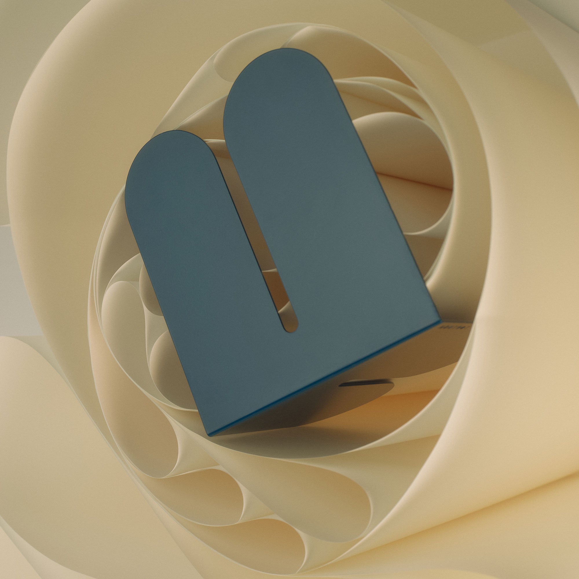
The name was the starting point. (Tortuga means "turtle" in Spanish.) Then we developed the brand's qualities of being "timeless", "flexible," and "modular", and put these three concepts together into a living logotype. The dynamic logotype's movement suggests the calmly determined way turtles move through the water. We also wanted to project a style which is classic and timeless because that’s what their furniture is.

Hey Studio, TORTUGA logo, 2018.
As a woman running a business, what are some valuable experiences you could share on creating a positive workplace culture?
I am female but actually the team is and has always been mixed. I don’t want to make gender a thing or Hey into a studio that is about that because gender, rightly, isn’t important. Talent and personality are much better criteria for selecting a team than what reproductive organs they have! Running a business as a woman in a world that is still, at times, so depressingly sexist is obviously difficult at times. From the beginning, one of my objectives was to create a positive atmosphere where everyone could explore and push their creativity. Everyone spends much of their life at work, so making the workplace an environment one wants to be in is an important part of getting the team to achieve its best. I would say, don’t overthink workplace culture - just focus on the things that allow everyone to get on with what they are good at and that’s what they will do.
Favorite piece of furniture or object in your home?
Vitra Aluminium Chair. I sit on it every day in the office so we have quite a strong relationship and a fair bit of history together. It’s not just what it means, but what it is. It’s a design classic that gets used everyday.

Photo by Enric Badrinas, 2018.
Best designed book on your shelf?
Actually it is a magazine. Avant Garde’s 5th issue was published in November 1968 and the cover illustration was created by Tom Wesselmann. It has all the elements I love: simple bold forms and intense colours that combine to create an impact much greater than the sum of its parts. I also love how risqué it was for a magazine cover back then. Making such an erotic image so publicly visible must have shocked many people, which is exactly what I imagine was the intention. The magazine’s readership would have loved that provocation and been drawn to it, which means it worked.

Tom Wesselmann, Avant Garde Magazine, 1986.
Favorite Every Hey avatar? (if you can say)
Snow White. She takes me right back to my childhood. That was kind of the point of all the characters: to tap into something way back in people’s past, using the most minimal of styles, to provoke a reaction and a feeling of nostalgia.

Hey Studio, Snow White "Every Hey Avatar," 2014.
Favorite Pantone color (right now)
This is difficult to answer because I love all colours. But, if pushed, I would have to admit that I am a big fan of red. So P 185, which is a strong red but at the same time very delicate.

Favorite Font (right now)
Neue Unica Haas. It’s a mixture of different typefaces I like: Helvetica, Univers, and Akzidenz Grotesk.


